It is possible to create menus in SharePoint without having to use JavaScripts. The main advantage of not using JavaScript is that there's no need to have JavaScript enabled on visitors' computers. The menu will still work seamingless, won't break, and all images will be loaded regardless.
Another advantage of the solution presented on this post is that with other solutions you need 2-3 images per menu option: One for when the page is not active, one for when the user points at the menu option (hovers), and one for when the page is active. With the solution presented in this page, you will only need one image per menu option.
Finally, the last advantage is no flickering when hovering over the menu options. With other solutions where more than one image is used for each menu option status is a flickering effect when the browser tries to upload the image for each particular status. This flickering is more notorious if the network performance degrades for whatever reason. You can avoid this effect by implementing the present solution.
What you need:
- Stacked images (one for each menu option)
- HTML code for links
- CSS code
Step 1: Create a "Stacked" Image
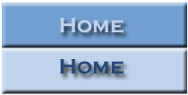
The first thing you need to do is create what's referred as a "stacked" image using a graphics tool such as PhotoShop, Fireworks, etc. A stacked image is an image that contains all states (inactive and hover) in one single image stacked one on top of the other. (See image to the left for an example.)
You will need to create one of these images per as many menu options as you may have. Once you have created your images, upload them to the appropriate SharePoint image library.
Take note of the actual size of your image (on a related note, all images should be the same exact size to work smoothly). You will need this information in the third step, where you will set the appropriate values on the CSS code. In our example, the image size is 210 x 106 pixels.
Step 2: Create the Markup on the Master Page
The HTML code needed is just a link with an id and a span element wrapped around the link text. You will need to insert it on your customized master page and where you want the left navigator to display.
<a id="homeMenu" href="<insert link here>" title="Home"><span>Home</span>
The ID given to the link in the example is "homeMenu." This allows you to style the link via your CSS. Then, the actual link text is placed inside a span element, which means that you can hide the link text with your CSS and display the image instead, yet the link still looks like a regular text link to browsers not using the style sheet (such as, for example, a search engine spider or text-only browser).
You will need to insert this markup text for each of your menu options and changing the ID, HREF, and Title values for each option as appropriate.
Step 3: The CSS
Finally, to turn the regular text link into a rollover button, you need to modify your CSS style sheet by applying the CSS below.
You will need to insert this markup text for each of your menu options and changing the ID, HREF, and Title values for each option as appropriate.
Step 3: The CSS
Finally, to turn the regular text link into a rollover button, you need to modify your CSS style sheet by applying the CSS below.
#homeMenu
{
display: block;
width: 210px;
height: 106px;
background: url('<insert_link_to_image_here>) no-repeat 0 0;
}
#homeMenu:hover
{
background-position: 0 -106px;
}
#homeMenu span
{
display: none;
}
{
display: block;
width: 210px;
height: 106px;
background: url('<insert_link_to_image_here>) no-repeat 0 0;
}
#homeMenu:hover
{
background-position: 0 -106px;
}
#homeMenu span
{
display: none;
}
The display: block line allows you to give the link a width and height, as well as set your button image as a background. The next two lines set the width of the link element to the width of your image, but it also sets its height to half the height of the image (that would be the height of one of the button images in the stacked image). This means that just the top, normal button image will appear within the link by default. The bottom, which is the rollover image, is cut off, therefore remaining hidden.
The next line (background-position: 0 -106px;) selects the link's :hover pseudo-class to style the rollover state. What happens is that the background image shifts up, in this case by 106 pixels, which is half the image's height. This hides the normal button image above the top of the link element, revealing the rollover button image within the link. (Another way of thinking about it is as sliding the image upwards within the "window" of the link.) When the visitor moves their mouse away from the link again, the button slides back down 106 pixels, returning to its default position, and revealing the normal button image within the link.
The last line, display: none, hides the link text for browsers that support CSS and images.
(Optional) Step 4: Creating More Than One Button
If you want or need to create more than one rollover buttons, copy and paste the HTML and CSS as many times as needed. Just remember to give each button a unique ID in both the HTML and the CSS, as well as changing the background image for each button in the CSS.
Another alternative would be to style the link text to be in the center of the button image, rather than being hidden. In this case, you would only need one (blank) button image for all the menu options. The only con this approach has is that you lose some control over the look of your button text and the buttons may not look as nice.
Last Thing...
Don't forget to modify the master page to point to the customized CSS.
 RSS Feed