I sometimes receive a request from my customers to completely remove the first tab from the Top Nav.
SharePoint 2010 uses UL's and LI's for its navigation and this makes it a little bit harder to hide just one element. However, it is possible to do by modifying some settings of one of the CSS classes that handles the Top Nav.
To do so, open your copy of Microsoft's corev4.css file, locate the .s4-tn li.static class and set it to this:
.s4-tn li.static > a
{
display: none !important;
{
.s4-tn li.static > ul a
{
display: block !important;
}
Don't forget to check in (and publish, if appliable) your CSS file, then go to the browser and test it.
The solution presented here is an alternative to the Rollover Buttons Using CSS (Two Images Per Button) solution. For this solution I use: - One image per button needed - CSS - Content Editor Web Part I also like to refer to this solution as the "stacked image" solution. Step 1 - Create The Necessary Rollover Button Images
Use the imaging tool of your preference, such as Photoshop or Fireworks, to create an image for every button you will be needing for your particular case. You cann also get the buttons from a reliable, trusted source. Make sure that all of your buttons are of the same exact size and shape so it looks better. Once you have created or acquired the  images, upload them to the SharePoint library of your choice.
For our example, we're going to pretend that our image is contactus.png.
Step 2 - Create The Necessary CSS Styles
Within your copy of Microsoft's original css file, create the following classes,
#contactUs
{
display: block;
width: 210px;
height: 106px;
background: url('https://PathToImageLocation/contactus.png') no-repeat 0 0;
}
#contactUs:hover
{
background-position: 0 -106px;
}
#contactUs span
{
display: none;
}
Change width and height to match your image width and height, as well as the location to the file itself.
Step 3 - Display The Button On The Appropriate Page
Add a Content Editor Web Part to the page where you would like to display the button. Make all applicable changes to the web part, such as giving it a meaningful name, removing the chrome, etc.
Select the Content Editor Web Part Click here to add new content link.
Locate the HTML icon within the Markup section of the ribbon, select it, and then select Edit HTML Source.
Type in or copy and paste the code below in the HTML Source web page dialog that displays:
<DIV align=center><A id=contactUs title="Contact Us" href=DestinationURLhere target=""></A></DIV>
Replace the id value above with the name of your own CSS, as well as the title applicable to your own situation. Don't forget to also replace the URL to point to the file, site, Web site, library, etc., applicable to your needs.
This solution is for when you need to publish a button on a page, not on the Top Nav or Quick Launch.
I prefer using one single image per button and make the image "shift up and down" depending on whether is just active or being hovered. But there are going to be situations where two images are necessary. This is one solution I use for those cases.
For this solution I use:
- Two images (one for each button status)
- CSS
- Content Editor Web Part
Step 1 - Create The Necessary Images Using a Graphics Tool
Create your own button using an application such as Photoshop or Fireworks, or use one from a trusted source.
The trick is to make the images look exactly the same size so when they swap they do so seamingless. You should also make sure that the label you will be using is of the exact same font type and size for both images. Feel free to change the font colour if the background of oneof the images merges too much with it. However, make sure to keep it the same size and font family, as well as position within the image, so they swap smoothly.
Once you have created or acquired the necessary images, upload them to the SharePoint library of your choice.
For our example we're going to pretend that our images are catalog.jpg and cataloghov.jpg.
Step 2 - Create The Necessary CSS Styles
Within your copy of Microsoft's original css file, create two classes. One will be used for one button status, while the other one will be used for the other button status.
Button Normal Status:
#catalog
{
display: block;
width: 155px;
height: 60px;
background: url("https://PathToImageLocation/catalog.jpg") no-repeat 0 0;
}
Change width and height to match your image width and height, as well as the location to the file itself.
Button Rollover Status:
#catalog:hover
{
background: url("https://PathToImageLocation/cataloghov.jpg") no-repeat 0 0;
}
Step 3 - Create The Content Editor Web Part to Display the Button
Insert a Content Editor Web Part on the page where you want to display the button. Make all applicable changes to the web part, such as giving it a meaningful name, removing the chrome, etc.
Select the Content Editor Web Part Click here to add new content link.
Locate the HTML icon within the Markup section of the ribbon, select it, and then select Edit HTML Source.
Type in or copy and paste the code below in the HTML Source web page dialog that displays:
<DIV align=center><A id=catalog title="Catalog" href=DestinationURLhere target=""></A></DIV>
Replace the id value above with the name of your own CSS, as well as the title applicable to your own situation. Don't forget to also replace the URL to point to the file, site, Web site, library, etc., applicable to your needs.
It is possible to create menus in SharePoint without having to use JavaScripts. The main advantage of not using JavaScript is that there's no need to have JavaScript enabled on visitors' computers. The menu will still work seamingless, won't break, and all images will be loaded regardless.
Another advantage of the solution presented on this post is that with other solutions you need 2-3 images per menu option: One for when the page is not active, one for when the user points at the menu option (hovers), and one for when the page is active. With the solution presented in this page, you will only need one image per menu option.
Finally, the last advantage is no flickering when hovering over the menu options. With other solutions where more than one image is used for each menu option status is a flickering effect when the browser tries to upload the image for each particular status. This flickering is more notorious if the network performance degrades for whatever reason. You can avoid this effect by implementing the present solution.
What you need:
- Stacked images (one for each menu option)
- HTML code for links
- CSS code
Step 1: Create a "Stacked" Image
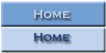 The first thing you need to do is create what's referred as a "stacked" image using a graphics tool such as PhotoShop, Fireworks, etc. A stacked image is an image that contains all states (inactive and hover) in one single image stacked one on top of the other. (See image to the left for an example.)
You will need to create one of these images per as many menu options as you may have. Once you have created your images, upload them to the appropriate SharePoint image library.
Take note of the actual size of your image (on a related note, all images should be the same exact size to work smoothly). You will need this information in the third step, where you will set the appropriate values on the CSS code. In our example, the image size is 210 x 106 pixels.
Step 2: Create the Markup on the Master Page
The HTML code needed is just a link with an id and a span element wrapped around the link text. You will need to insert it on your customized master page and where you want the left navigator to display.
<a id="homeMenu" href="<insert link here>" title="Home"><span>Home</span>
The ID given to the link in the example is "homeMenu." This allows you to style the link via your CSS. Then, the actual link text is placed inside a span element, which means that you can hide the link text with your CSS and display the image instead, yet the link still looks like a regular text link to browsers not using the style sheet (such as, for example, a search engine spider or text-only browser).
You will need to insert this markup text for each of your menu options and changing the ID, HREF, and Title values for each option as appropriate.
Step 3: The CSS
Finally, to turn the regular text link into a rollover button, you need to modify your CSS style sheet by applying the CSS below.
#homeMenu
{
display: block;
width: 210px;
height: 106px;
background: url('<insert_link_to_image_here>) no-repeat 0 0;
}
#homeMenu:hover
{
background-position: 0 -106px;
}
#homeMenu span
{
display: none;
}
The display: block line allows you to give the link a width and height, as well as set your button image as a background. The next two lines set the width of the link element to the width of your image, but it also sets its height to half the height of the image (that would be the height of one of the button images in the stacked image). This means that just the top, normal button image will appear within the link by default. The bottom, which is the rollover image, is cut off, therefore remaining hidden.
The next line (background-position: 0 -106px;) selects the link's :hover pseudo-class to style the rollover state. What happens is that the background image shifts up, in this case by 106 pixels, which is half the image's height. This hides the normal button image above the top of the link element, revealing the rollover button image within the link. (Another way of thinking about it is as sliding the image upwards within the "window" of the link.) When the visitor moves their mouse away from the link again, the button slides back down 106 pixels, returning to its default position, and revealing the normal button image within the link.
The last line, display: none, hides the link text for browsers that support CSS and images.
(Optional) Step 4: Creating More Than One Button
If you want or need to create more than one rollover buttons, copy and paste the HTML and CSS as many times as needed. Just remember to give each button a unique ID in both the HTML and the CSS, as well as changing the background image for each button in the CSS.
Another alternative would be to style the link text to be in the center of the button image, rather than being hidden. In this case, you would only need one (blank) button image for all the menu options. The only con this approach has is that you lose some control over the look of your button text and the buttons may not look as nice.
Last Thing...
Don't forget to modify the master page to point to the customized CSS.
Every time we had to start working on a new SharePoint site that had to be customized for look and feel and for which we' would be using the v4.master master page, we always ended up having to clean our own copy of the corev4.css file. One day we got tired of doing this and we decided to export a clean copy of the css file where the whole team could get it from whenever they needed it.
So here's the file I'm talking about.
Sometimes Microsoft’s CSS still gets in the way of your own code, either not allowing you to make some changes to colours, or ignoring your colour settings completely. Well, I have yet to fix it for the colouring problem. However, I was facing a similar situation where my links were being displayed too way apart (like a good 14 pixels in between them) when I had set it up to have only like 4 pixels in between each (padding-bottom: 4px). So when trying to find out where the code was coming from, I discovered that Microsoft was using not just the corev4.css but also a few other CSS files. One of these files, the one that was overriding my CSS settings was called ‘controls.css.’ (Note: SharePoint uses even other ones other than control.css; that was the one that was messing up my one site; your case could be different.)
I remembered that in MOSS 2007 we had more than one external CSS files being referenced by the selected master page for the site. In that version of SharePoint, depending on which master page we would select, the number of external CSS files would vary. If you have already been modifying any master page in SharePoint 2010, you already know that it does not come with any external CSS registration inside the <head> tag of the master page. You have to manually insert it. I’m talking about the following line of code for a v4.master page in this case:
<SharePoint:CssRegistration Name="<% $SPUrl:~sitecollection/Style Library/YourCoreFileNameHere.css %>" After="corev4.css" runat="server"/>
That way, you can tell the system to first pull the corev4.css and then yours. But still, Microsoft and SharePoint have a mind of their own and sometimes yet another CSS code or file overrides yours. So I wondered if we could declare more than one external CSS files like we used to do in MOSS 2007 so as to override any other ones that could be overriding ours. And after trial and error, I can say that the answer is yes.
But there is a trick to it: You have to follow a specific order. In MOSS 2007 that order was alphabetical. In SharePoint 2010 is ‘linear.’ (I don’t know which other way to call it.) While working on one of my company's portals I discovered that in that particular case it was not only using the Corev4.css, but I also discovered that under certain circumstances, it was pulling the control.css file. So I had to declared my external CSS files in the order of priority, with the most important one being declared at the top and the least important one at the bottom. For that particular project, I only had two files. And this is how I declared them:
<SharePoint:CssRegistration Name="<% $SPUrl:~sitecollection/Style Library/en-us/Themable/Core Styles/PROJACRONYMcontrols.css %>" After="PROJACRONYMCore.css" runat="server"/>
<SharePoint:CssRegistration Name="<% $SPUrl:~sitecollection/Style Library/PROJACRONYMCore.css %>" After="corev4.css" runat="server"/>
By declaring them in this order, I’m telling SharePoint that I first want it to run its own corev4.css, followed, by PROJACRONYMCore.css, which is followed by PROJACRONYMcontrols.css. This way, I have guarantee that my CSS files are going to pull in the priority I want them to and not the way SharePoint feels like it. It is very important that you pay attention to the order; otherwise, it will not work.
Oh, one more thing. If you have no idea which CSS file Microsoft SharePoint could be using and referencing, use any developer's tools you may have access to. If you are using Microsoft's Internet Explorer, press <F12> on your keyboard. This will open the Developer Tools window. Point to the location on the page where the code is not doing what you want it to do and you will see a blue rectangle appearing on the screen (if you are using IE). Then click and you will see a list of CSS files (in the right frame of the Developer Tools window). The one at the bottom is the one that is overriding yours. Click the link (its name) and it will display the code and you will also know the exact location for the file. Then go to SharePoint Designer, make a copy of that CSS file, (never work on the original files, please), rename it, and then modify the setting that is not doing what you want it to do. Check it in and publish it. Finally, go back to your master page and register the new file along with your other ones and in the order I shared above. Publish your master page and verify in the browser if it’s now displaying things the way you want it to.
To register and reference your external CSS file on a custom SharePoint 2010 master page, insert the following line inside the <head> tag of your custom master page. <SharePoint:CssRegistration Name="<% $SPUrl:~sitecollection/Style Library/ YourCoreFileNameHere.css %>" After="corev4.css" runat="server"/> To register more than one CSS external file, check this other post.
Note: I always recommend making copies of Microsoft files and pages and not to work on them directly. For what I described above, I usually make a copy of the v4.master master page and I also make my own copy of the corev4.css file, leaving both the original v4.master and corev4.css files alone.
|
 RSS Feed