It is not unusual that customers will ask for list filters to be created. While many users who are used to SharePoint would probably use the column headers to filter, not all users are SharePoint savvy and that's how I get those requests.
This solution will show how to create an alternative for those cases when customers want something looking more like a regular Web page and not like a SharePoint list.
The elements I usually use for this solution are:
- Filters (Blank Web Part) page
- Custom list with the information to be filtered
- HTML Form Web Parts, one per needed filter
- HTML custom code
- Data Connections
Step 1 - Create Custom List
For the sake of time, I'm going to assume you have your custom list already created, including views and everything else. In my example, I'm going to be using a very simple list that tracks people on duty for three available shifts (morning, afternoon, and evening).
Step 2 - Create Filters Blank Web Part Page
In SharePoint, go to the Pages library and create a Blank Web Part Page and name it Filters or anything else that might better suit your needs.
Step 3 - Add HTML Form and List Web Parts to the Filters Page
Edit the Filters page and add one HTML Form web part for each filter you are going to be needing plust the Clear All Filters button within the web part zone or zones of your choice. Add the custom list view web part somewhere on the page, as well. And don't forget to edit the list web part to apply the list view of your choice.
I don't like the web part chromes, or their titles. So I usually remove all those settings and I add Content Editor Web Parts right above or next to the HTML Form Web Parts to include meaningful text for my users and I format the text to my needs. So feel free to do so, as well.
Step 4.a - Provide Appropriate HTML Code - Clear All Filters
Edit the HTML Form Web Part that will be acting as the Clear All Filters button.
Select [Source Editor...] at the Form Content Editor section of the web part tool pane. This is how the code usually looks:
<div onkeydown="javascript:if (event.keyCode == 13) _SFSUBMIT_"><input name="T1"/><input value="Go" onclick="javascript:_SFSUBMIT_"/></div>
One comment about this code. I don't know in your experience, but in mine, many users do not really understand what 'Go' means. So for this reason, I always prefer to change that to either Clear All Filters, or Apply Filter depending on my situation. So in this case, it is going to be renamed to Clear All Filters. And I also modified the rest of the code to look like this:
<div style="text-align: left">
<input onclick="location.href='https://SiteURL/Pages/Filters.aspx'" value="Clear All Filters"/>
</div>
(Note: If the code above gives you trouble, see the note added on August 2012 at the bottom of this post)
<input onclick="location.href='https://SiteURL/Pages/Filters.aspx'" value="Clear All Filters"/>
</div>
(Note: If the code above gives you trouble, see the note added on August 2012 at the bottom of this post)
If you would prefer a different alignment, replace left with either right, or center. Replace SiteURL in the code above to the full path to your Filters page. Save the web part. This code will simply "refresh" the page to make it look like the list has been cleared of all filters when selected (clicked).
Step 4.b - Provide Appropriate HTML Code - By Person
Edit the HTML Form Web Part that will be acting as the first of your filters; in our example, the first filter will be used to filter the list based on person name. Select [Source Editor...] at the Form Content Editor section of the web part tool pane and replace the code with the following,
<left>
<div onkeydown="javascript:if (event.keyCode == 13) _SFSUBMIT_">
<select name="Title">
<option value=""></option>
<option value="Anne">Anne</option>
<option value="Jane">Jane</option>
<option value="Mary">Mary</option>
<option value="Susan">Susan</option>
<option value="Tim">Tim</option>
</select>
<input type="button" value="Apply Filter" onclick="javascript:_SFSUBMIT_"/></div>
</left>
If you would prefer a different alignment, replace left with either right, or center.
Since I used the Title column to save the names on my list, this is the value I input where it reads select name, even when I renamed that column to Name. It is important to point out that the code will only work with the internal name of the column.
The first option value remains with no option for when nothing has been selected, yet. Replace the rest of the values and add or remove lines to matching your needs.
Save the web part.
Step 4.c - Provide Appropriate HTML Code - By Shift
Repeat all the steps in section 4.b and replace the code with the following,
<left>
<div onkeydown="javascript:if (event.keyCode == 13) _SFSUBMIT_">
<select name="Title">
<option value=""></option>
<option value="Morning">Morning</option>
<option value="Afternoon">Afternoon</option>
<option value="Evening">Evening</option>
</select>
<input value="Apply Filter" onclick="javascript:_SFSUBMIT_"/></div>
</left>
Make changes as appropriate to match your needs and save the web part.
Step 5 - Establish the Data Connections
This is where people may differ on how to proceed. Some people use SharePoint Designer to establish the data connections. However, for simple data connections like the ones in this example, you may establish them within SharePoint itself. And that's what I'm going to explain in the next lines.
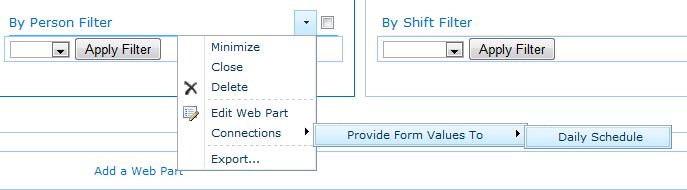
Edit the first HTML Form Web Part (By Person). Select Connections > Provide Form Values To > Daily Schedule (or the name of your list).
Step 5 - Establish the Data Connections
This is where people may differ on how to proceed. Some people use SharePoint Designer to establish the data connections. However, for simple data connections like the ones in this example, you may establish them within SharePoint itself. And that's what I'm going to explain in the next lines.
Edit the first HTML Form Web Part (By Person). Select Connections > Provide Form Values To > Daily Schedule (or the name of your list).
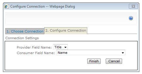
SharePoint displays the Choose Connection web page dialog. In the 1. Choose Connection tab, select Get Filter Values From at the Connection Type drop-down list and then select [Configure].
SharePoint switches to the 2. Configure Connection tab. Select the Provider Field Name (for our example, that would be Title) and the Consumer Field Name (For our example, Name) from the respective drop-down lists and then select [Finish].
Edit the second HTML Form Web Part (By Shift). Select Connections > Provide Form Values To > Daily Schedule (or the name of your list).
SharePoint displays the Choose Connection web page dialog. In the 1. Choose Connection tab, select Get Filter Values From at the Connection Type drop-down list and then select [Configure].
SharePoint switches to the 2. Configure Connection tab. Select the Provider Field Name (for our example, that would be Title) and the Consumer Field Name (For our example, On Duty) from the respective drop-down lists and then select [Finish]
Save the page. Test the filter buttons. If everything looks satisfactory, check the page in (and publish it if publishing is turned on for your site).
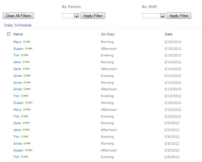
This is how my page looks like now:
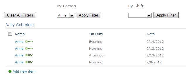
If I apply the By Person filter for 'Anne,' this is how it looks:
And this is how it looks if I apply both By Person = Anne and By Shift = Morning.
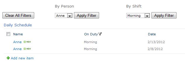
Note: When teaching your site users how to apply these filters, you will need to point out that they will need to select [Apply Filter] for all the filters they would like to apply, one at a time.
UPDATED January 2013: I had some problems reusing the code for the Clear All Filters button at a different customer. I had to swap some things around and this is the resulting code, which you can try if you are experiencing problems, as well:
<div onkeydown="javascript:if (event.keyCode == 13) _SFSUBMIT_"><input type="button" value="Clear All Filters" onclick="location.href='https://SiteURL/Pages/Filters.aspx'"/></div>
Bonus: Code for ABC Filter
<div onkeydown="javascript:if (event.keyCode == 13) _SFSUBMIT_">
<select name="IndexChar">
<option value=""></option>
<option value="A">A</option>
<option value="B">B</option>
<option value="C">C</option>
<option value="D">D</option>
<option value="E">E</option>
<option value="F">F</option>
<option value="G">G</option>
<option value="H">H</option>
<option value="I">I</option>
<option value="J">J</option>
<option value="K">K</option>
<option value="L">L</option>
<option value="M">M</option>
<option value="N">N</option>
<option value="O">O</option>
<option value="P">P</option>
<option value="Q">Q</option>
<option value="R">R</option>
<option value="S">S</option>
<option value="T">T</option>
<option value="U">U</option>
<option value="V">V</option>
<option value="W">W</option>
<option value="X">X</option>
<option value="Y">Y</option>
<option value="Z">Z</option>
</select>
<input value="Apply Filter" onclick="javascript:_SFSUBMIT_"/></div>
</left>
 RSS Feed